London-based marketing agency LogicLogicMagic sent me a brief to paint three guitars as part of their clients marketing campaign, culminating in the guitars being offered as prizes in at a London exhibition.
Scroll to the end to see how it ended! Or just read the whole story.
The brief included the design, colour codes, artwork for the logos and deadlines. They were to send me the guitars, including cases, which then had to be painted according to the agreed design, and sent to the client in time for the show.
I love a challenge, and my extensive background in marketing and professional graphic design really came in handy.
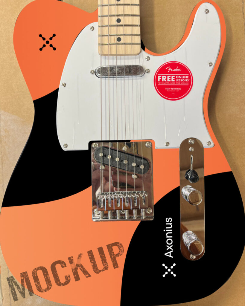
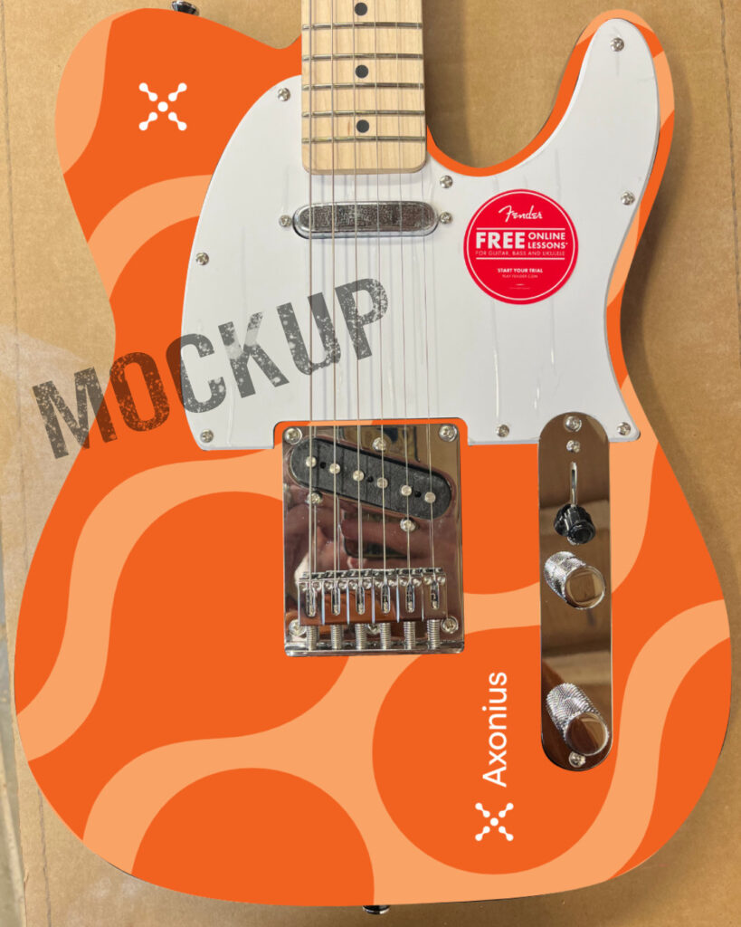
As with most projects, particularly involving graphics, I prepared some mockups. Managing expectations is always key, and this time I wanted to make sure the logos and graphics would line up properly with the hardware and body shape. Nobody can read minds, so this is a good way to make sure we’re all on the same page.
All three guitars were Squier Telecasters, delivered directly from the distributor. I also got three hardshell cases, which made shipping them out again much safer.
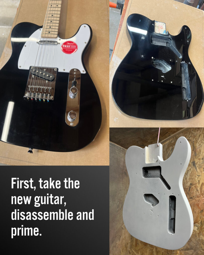
The first step was straightforward – strip the guitars, lightly sand and prime. All the parts were placed in separate boxes and labelled so that I could reassemble each guitar with its original parts once the painting was completed.
Design 1 of 2
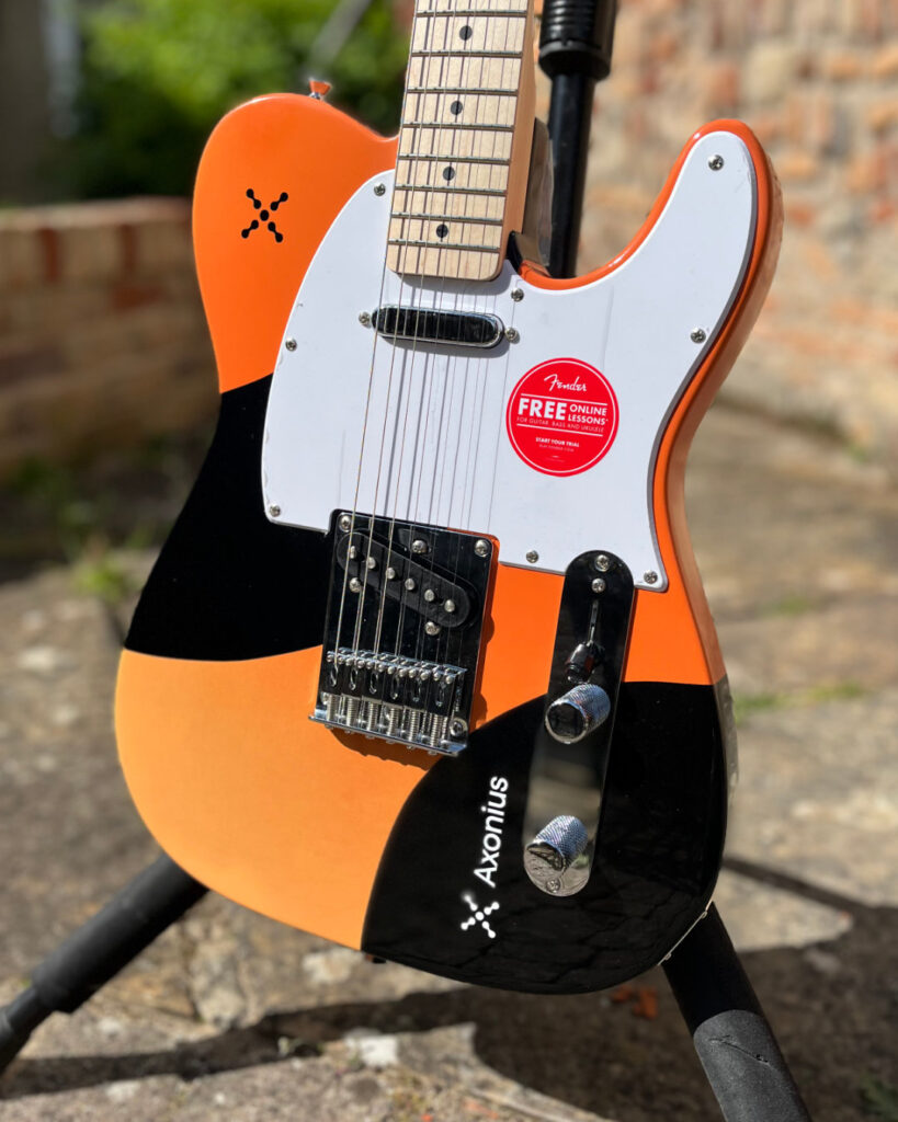
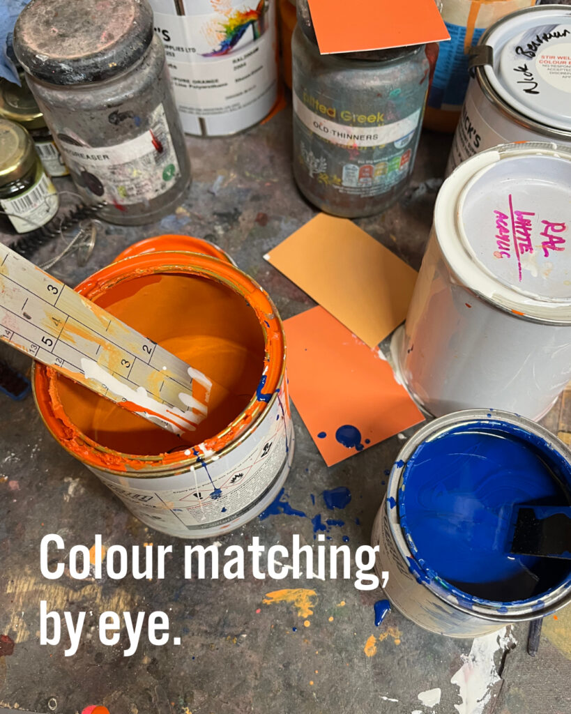
The next challenge was colour matching. The two orange colours which had to be faded into each other were the colours used in the client’s branding. LogicLogicMagic provided me with several codes – RGB (used for screen colours), CYMK (for four colour printing) and Pantone (a precise print colour system where each colour has a specific code) – taken directly from the company’s branding guidelines. I’ve read, and written, enough branding guidelines to know that they are set in stone and to be adhered to at all costs, so the colours had to be right. The problem here is that you cannot mix or order paint according to print codes, so I had to find another way to match colours.
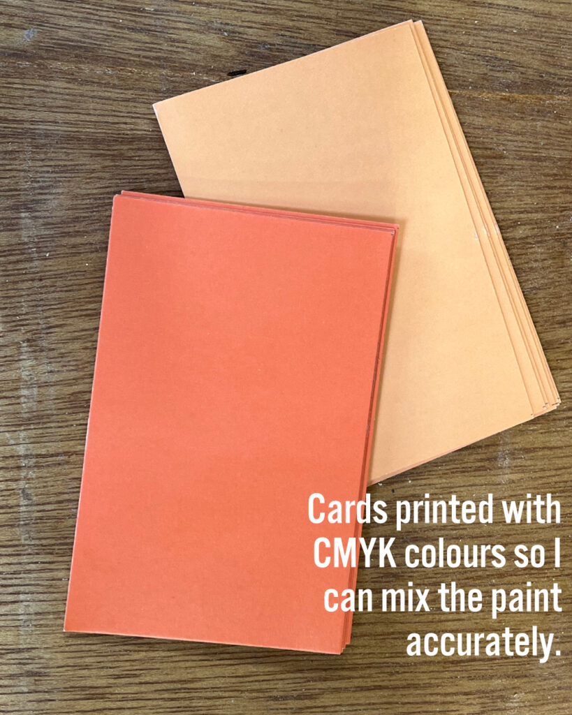
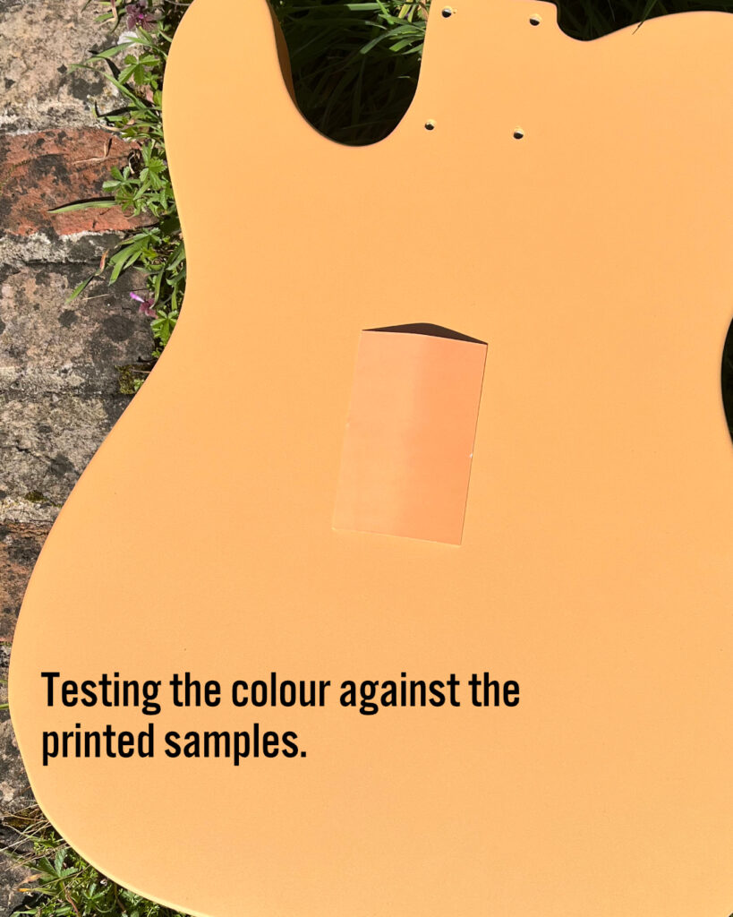
I ordered a batch of cards printed with plain Pantone colours, and mixed the polyurethane colours by eye, using orange, white, blue and red RAL colours. After a lot of back and forth and testing in different light sources, I got a set of colours I was happy with.
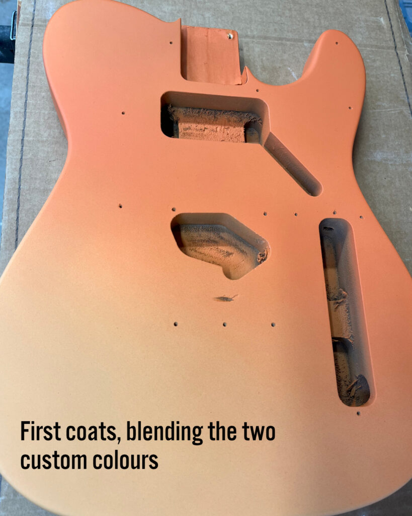
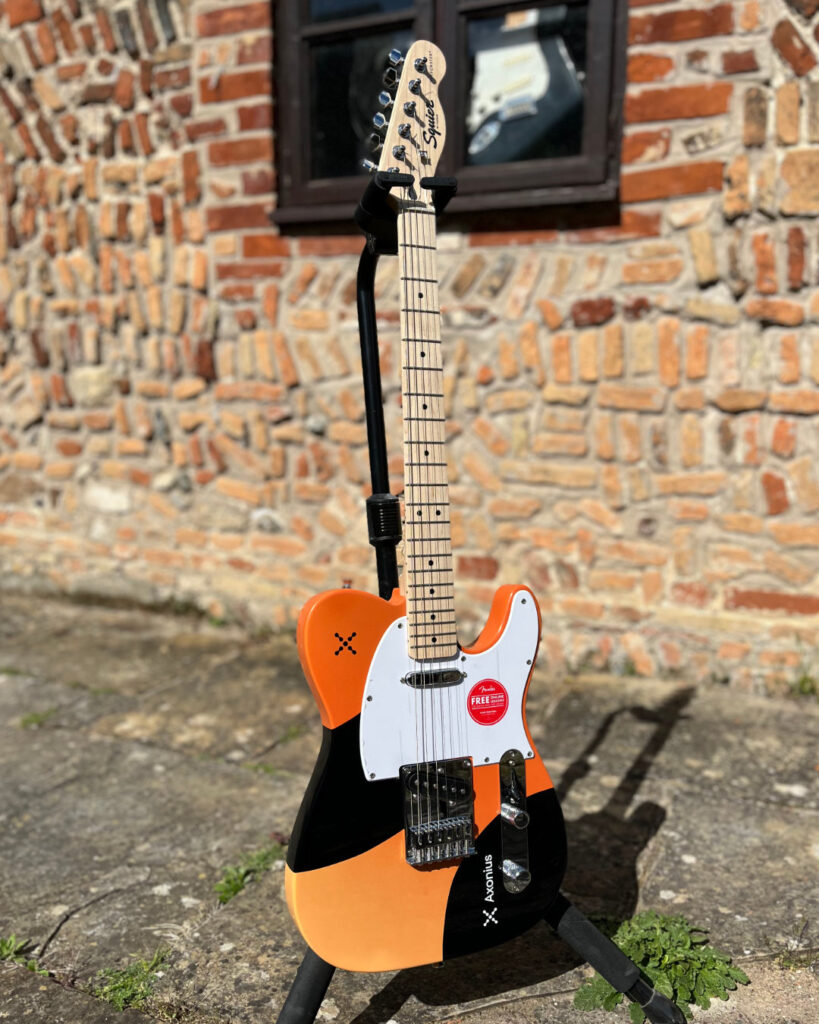
Now I had to paint the base coat for each guitar, blending the two oranges to make a nice, even fade.
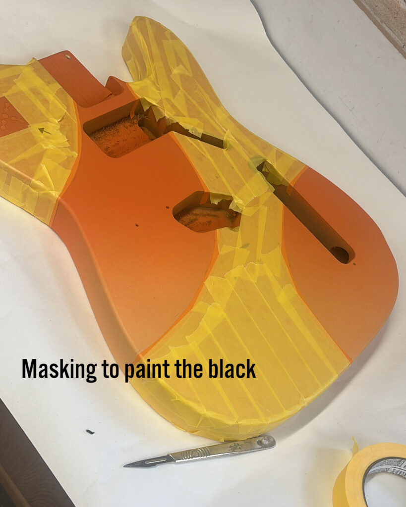
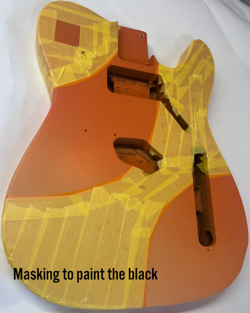
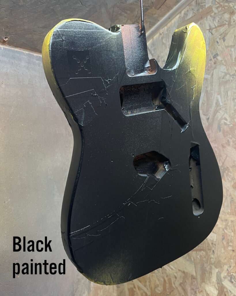
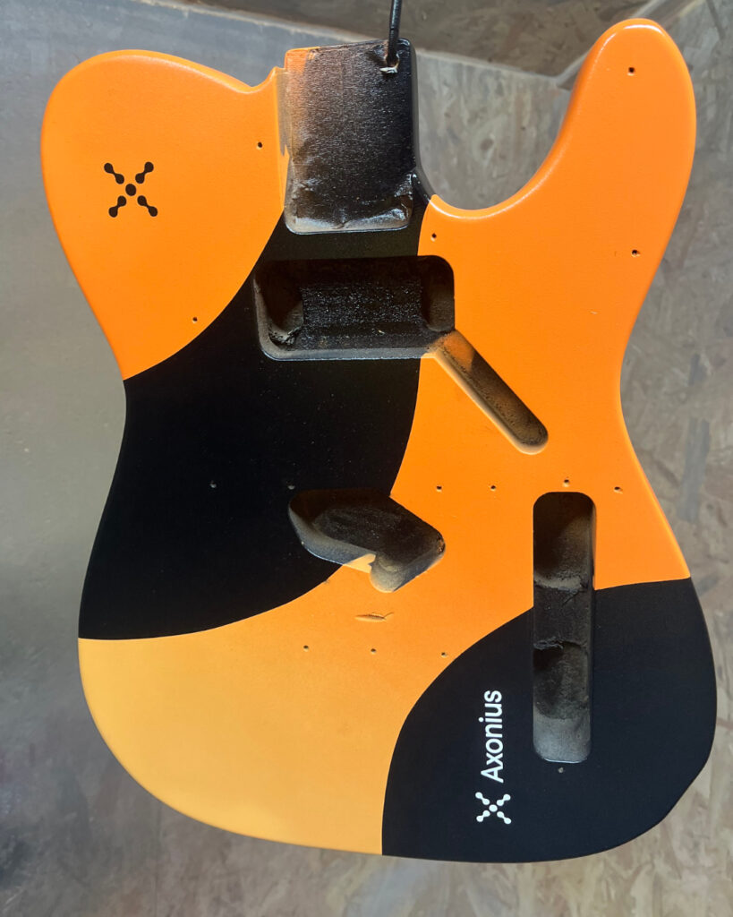
Then it was time to spray the black shapes, which required masking.
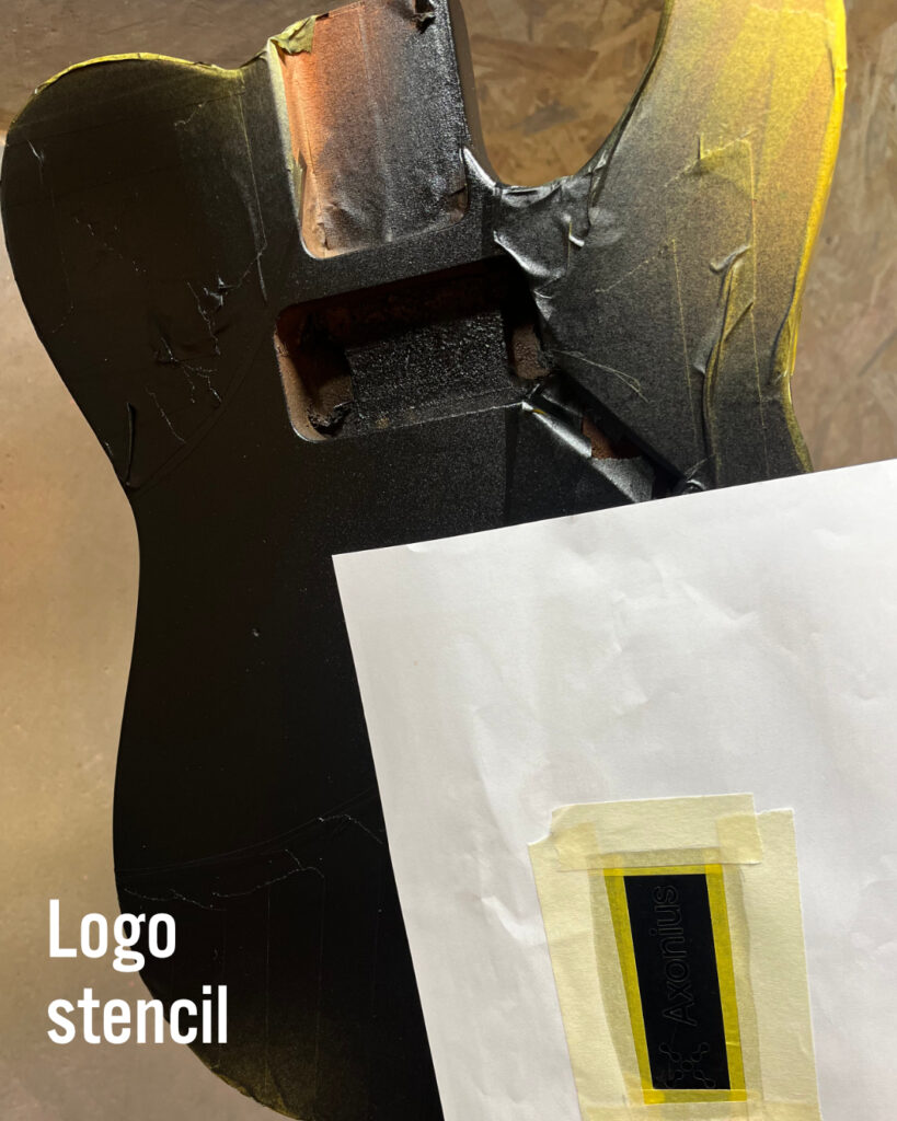
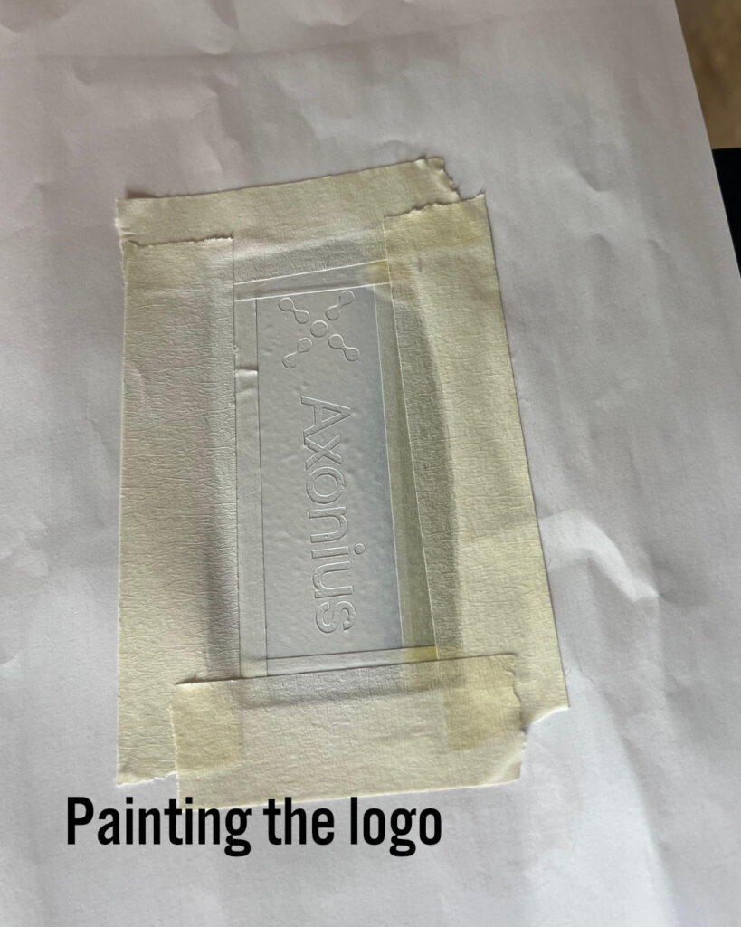
The next challenge was to spray the logos. The client provided me with vector artwork to recreate the logo. Now all I had to do was make some stencils to spray the logos.
For this, I enlisted the help of Jack Clark of JC Guitar Company. Jack did a fantastic job of creating the stencils so that even the very tricky centres (like the letter o and capital A) would stay in place. Painting them was a breeze, and I think they came out perfectly. Thanks Jack!
Design 2 of 2
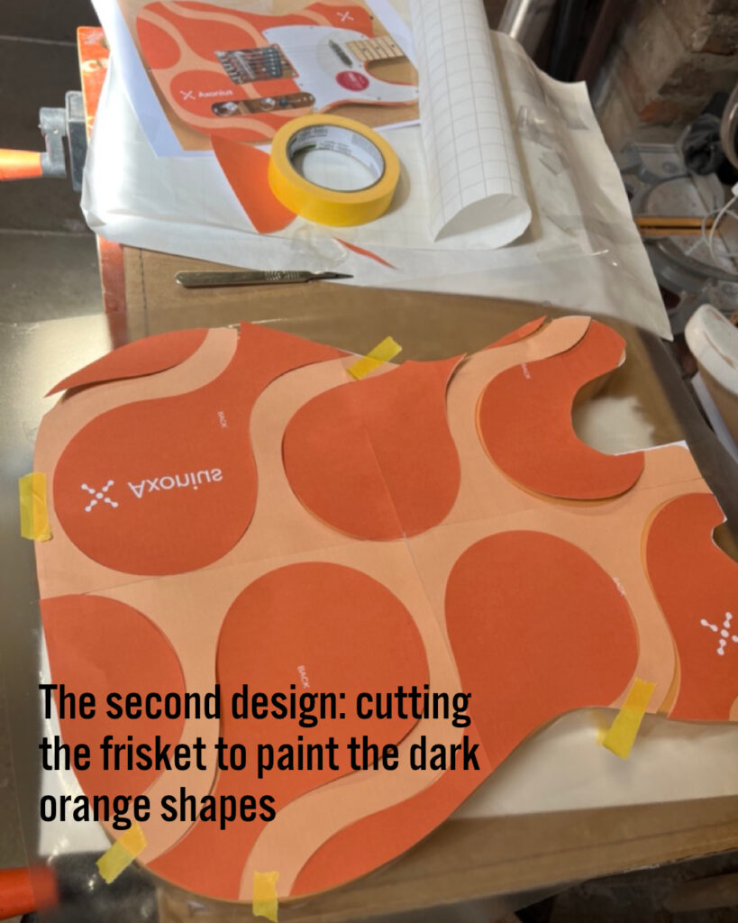
The second design featured a flat orange background and a darker orange foreground using the same two orange colours as the first design. Instead of masking tape, I used frisket film, laying it over a printed design and cutting the film with a scalpel-like knife.
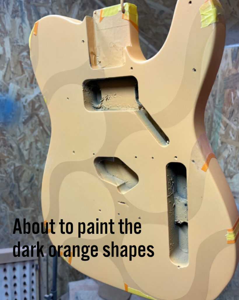
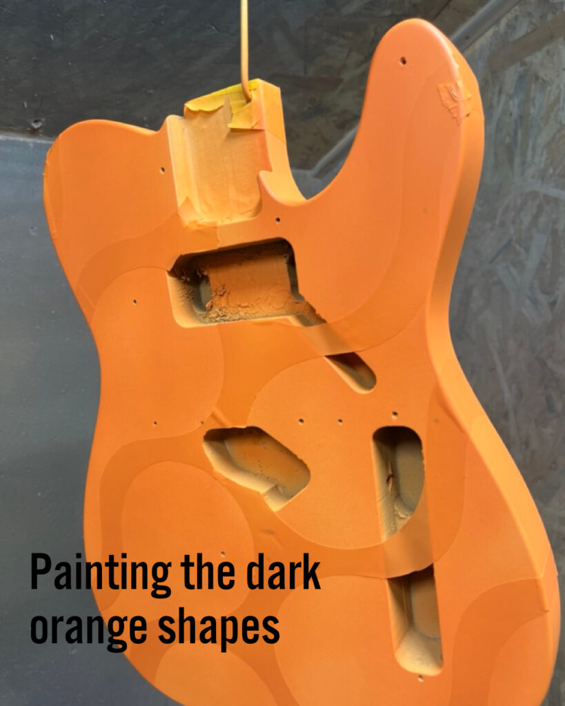
I completed the colour coats and sprayed each guitar with a number of coats of clear, gloss polyurethane. After wet sanding and buffing, they were then placed carefully in hardshell cases and shipped to the client.
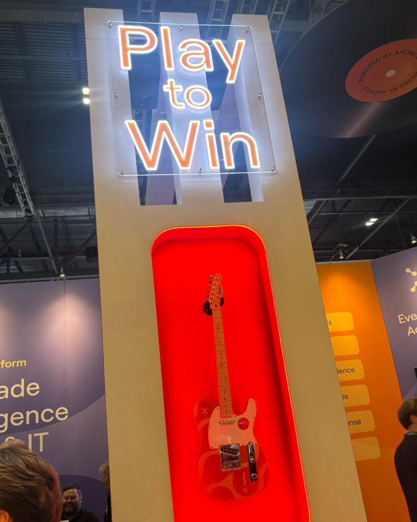
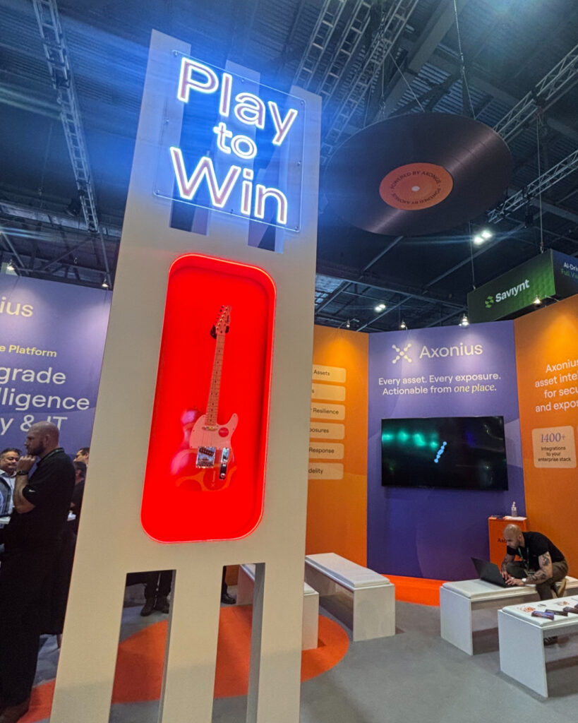
Here you can see one of the designs in place at the exhibition in London, awaiting the draw to announce the lucky new owner.